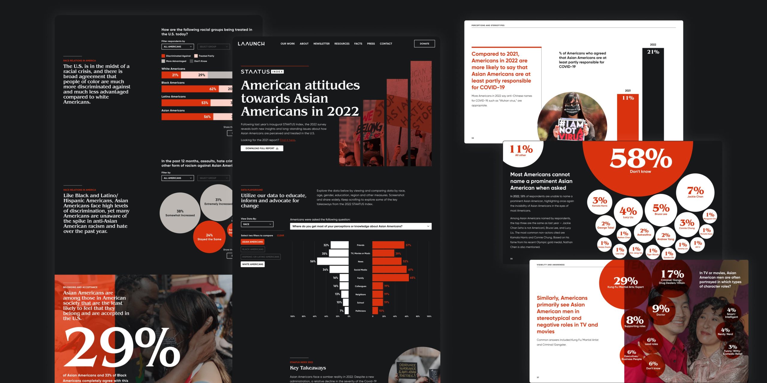
STAATUS Index 2022
Overview
In its second annual report, in response to the continued violence against Asian Americans in the U.S., Leading Asian Americans to Unite for Change (LAAUNCH) partnered with The Asian American Foundation (TAAF) to conduct a follow-up study to unearth data on the attitudes and perceptions of Asian Americans.
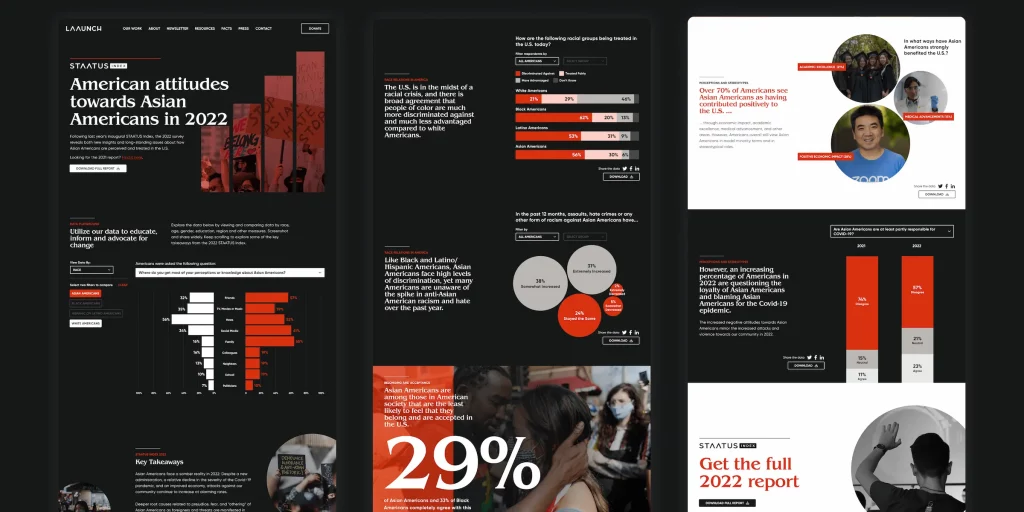
On my team at The DataFace, I was tasked with leading the design phase to create both a PDF report and an interactive data-driven microsite with the goal of arming policymakers, educators, business leaders, the media, and other Asian American organizations’ information to help drive actionable change.
Software and Frameworks


My Role
I was tasked with developing the flow of the information for both the PDF report and microsite designs. I also designed data viz elements, choosing chart types that best fit the information being presented. I worked with my talented teammates to bring it all to fruition.
My Team
Tiziana Alocci (Data Viz Design), Sam Vickars (Design Management), Jack Beckwith (Creative Director, Data Analytics), Michael Hester (Web Development), Sawyer Click (Data Viz Development)
Project Partners
Data Sources
The STAATUS Index survey data was provided by our client. Participants included US residents, ages 18 and over, conducted online by Savanta Research. It included multiple question types and pulled demographic data on respondents for comprehensive analysis.
Process
Data
Raw survey data was imported to Tableau for internal analysis and shared with the client for review. From there, my team and I collaborated with them to pull key insights and decide on the best way to present the findings.
Branding
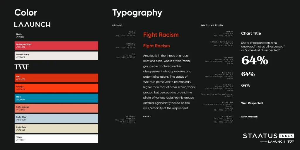
We were provided updated branding guidelines from the client, which included new colors that reflected the collaboration between both LAAUNCH and TAAF. This year we opted for a cleaner and more modern aesthetic.
Inspiration
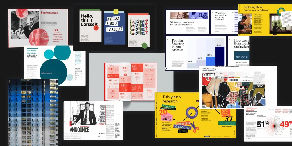
I gathered inspiration from various places on the web for PDF layouts, graphic elements, website design, photography, type styling, and more. We wanted to keep in mind the core brand as well as incorporate elements that evoked the proper feel and tone for the report.
The PDF
Templates
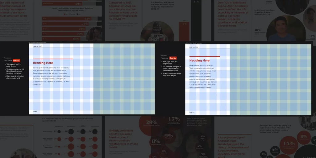
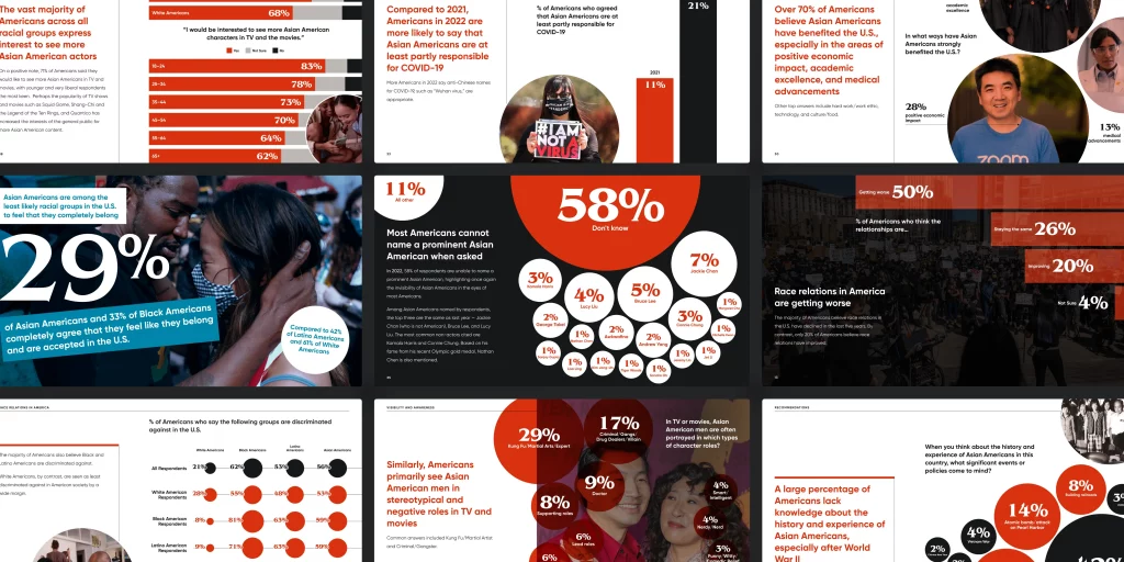
To streamline the design process, I templated the PDF page elements (typography, grid layouts, page elements, etc) upfront so we could reuse them repeatedly. I leveraged thinking I’d learned from the challenges we had when crafting the 2020 report.
Sketching and Data Exploration
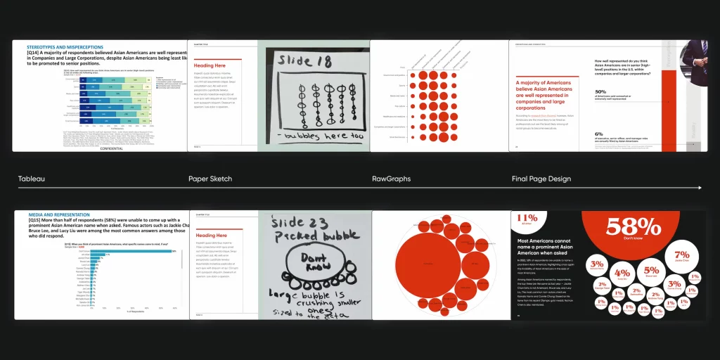
Sketching out ideas before diving into any design tools was key in iterating on the data viz for this report. I took the simplistic initial visualizations from Tableau and explored ways to represent the data in a dynamic and visually stunning way. A simple sketch was turned into a visualization using RawGraphs, then imported as a .svg into Figma. Sometimes, what was sketched didn’t end up being the final result, and that’s okay.
Imagery
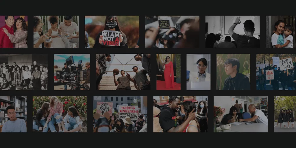
Choosing the right photographs was an important and time-intensive part of this project. We wanted to choose images that evoked the multitudes of the Asian American experience and were appropriately paired with the data being presented. I spearheaded the image sourcing process with assistance from the client side. We sourced a mix of free, paid, and personal photos.
The Microsite
What are my takeaways?
- The STAATUS Index was one of the first projects I worked on when I first joined The DataFace in April of 2021 (you can read the 2021 case study here.) Since then, I have learned so much about data visualization design.
- I’m deeply passionate about projects in the realm of social justice, social impact, and around awareness of societal problems. Being able to work on this initiative for a second year was such an amazing opportunity.
- Although I’m not Asian American, as a Black American, solidarity, and contribution to the expansion of human rights for all is something very important to me in my design work.
Evaluating Metrics
- Hillary Clinton tweeted about the report, which was great for visibility in the political sphere. Certainly, something to highlight.
Stereotypes that lead to violence against Asian Americans are worsening, according to new data from a @taaforg and @go_LAAUNCH survey.
— Hillary Clinton (@HillaryClinton) May 4, 2022
Information like this is crucial for identifying solutions to ensure AAPIs can feel the sense of belonging they deserve in this country. https://t.co/rkBmoQgSfI
- Although this years report didn’t garner as much media visibility in its second year (compared to the first one we did last year) it still gained solid ground and remains an important part of the broader narrative.
A beacon for fashion student collaboration.


