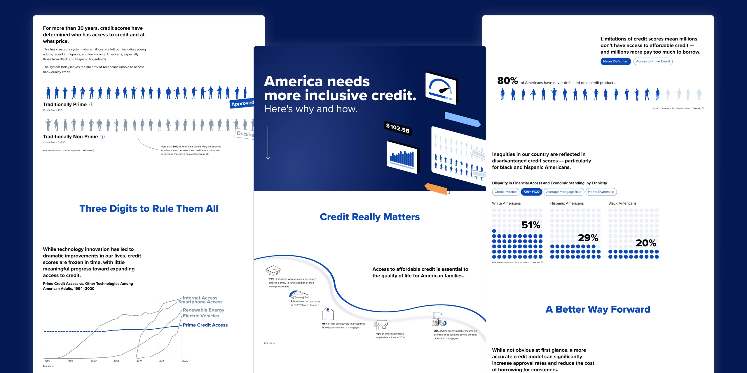
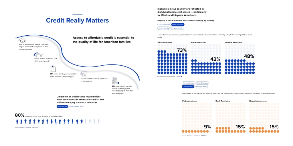
MoreThanFair is an initiative that galvanizes financial institutions in America around the need to make credit access more inclusive to all. Millions of Americans are financially underserved, and without access to fair credit, they are robbed of opportunities to improve their lives. This is especially true for young adults, recent immigrants, and low-income Americans, especially those from Black and Hispanic households.
We were tasked by our client, Upstart, with building an interactive microsite to highlight these disparities and bring awareness, as well as partner with other institutions to bring change.
I was tasked with helping to develop the visual branding, typography, color scheme, and flow of information for the microsite. I collaborated with my team to streamline and iterate on these elements throughout the design and development process.
My Team
Sam Vickars (Design Management), Jack Beckwith (Creative Director, Data Analytics), Michael Hester (Web Development), Sawyer Click (Data Viz Development)
Project Partners
Process
Data
The data used in this project was sourced from various financial institutions, open-source data, as well as data studies conducted by Upstart in collaboration with other entities.
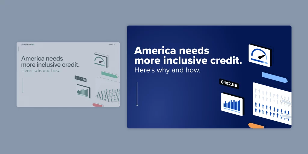
Branding
The design language for this site was created from scratch and iterated upon several times before landing on an aesthetic that our stakeholders liked. We started out with completely different color and typographic choices at the onset, but changed gears to a more modern and relevant look and feel.
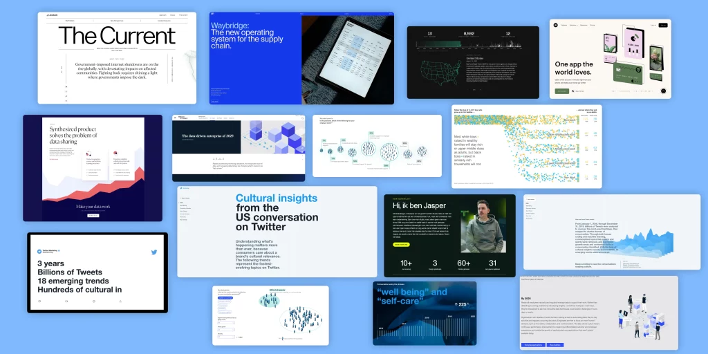
Inspiration
We gathered inspiration from various places on the web for data viz types, website design, type styling, and more. We wanted to keep the target audience in mind and evoke a feeling appropriate for finance and technology. There was a lot of blue and green, as expected.
Iteration
As I mentioned, we iterated a few times on the aesthetic of the site, but we also did so with the data visualizations we wanted to display. It was important to our client to make the information easy to understand and not overly complex. This lengthened the scope of the project dramatically, however, all parties felt it was best to get the aesthetics just right.
What are my takeaways?
As someone who grew up with a lot of financial barriers and a lack of financial education and access, being able to work on a project like this was deeply meaningful to me.
Sometimes the iteration process is long, especially when branding an experience from scratch. There are aspects of that which are fun, but others that are deeply challenging.
Soliciting client feedback isn’t always a simple process.
When an aesthetic doesn’t quite work the first time, try try again. Scrap a bit and leverage what’s working to propel the design forward.
Evaluating Metrics
The MoreThanFair community has seen growth in partners since its launch. Here is the tweet.
The growing MoreThanFair community of civil rights organizations, consumer advocates, and industry leaders is working to modernize our credit system and make lending more inclusive, transparent, and fair.