Meet the Project
We as students were tasked to create a landing page with the intention of driving downloads for an abstract app that promoted sustainable grocery shopping. The landing page should be attention grabbing and visually appealing, in additional to being a functional prototype.
The Problem
How might we improve the experience around shopping for local sustainable food that is affordable?
My Role
Visual Designer and Front End Designer (HTML/CSS)
Scope
Project Timeline: 2-3 weeks
Category: Responsive Web Design
Constraints
To understand prompted information opposed to being involved in the research process from the start of the project.
Users and Audience
We were presented in class with a few different scenarios and users to choose from and research demographics to inform our design choices. Our users were categorized by their income range, age, and their personal habits around grocery shopping and lifestyle choices.
I chose to center my design on the persona Elaine Chen, who is categorized as a young professional with a substantial amount of disposable income who is conscious about sustainable living.
UX Research
For the sake of the design exercise, we were given the findings of the User Survey and Interviews, the Personas, in addition to a ready made app prototype with the purpose of informing how we design. With all these in mind, it was time to design the landing page with the primary goal of driving app downloads.

Discovery
Analyze the Data and Understand Purpose
Presented with the research findings and demographic information, we were tasked to figure out what types of information users would need in order to accomplish our goal: which is to download the app from either the App Store or Google Play.
Design Process
Once the purpose and goal was understood, it was time to begin the designing. First by brainstorming iterations then furthering into refinement.
Step 1: Research design patterns and gather inspiration on sites such as Behance and Dribbble.
Step 2: Sketch on paper some ideas based on said research, I used timed Crazy 8's at first, then refined my idea further.
Feedback:
- Too many app previews — OVERKILL!
- I needed to rethink the layout and work out the hierarchy of importance for what the goals of the landing page were. It isn’t clear from this standpoint.
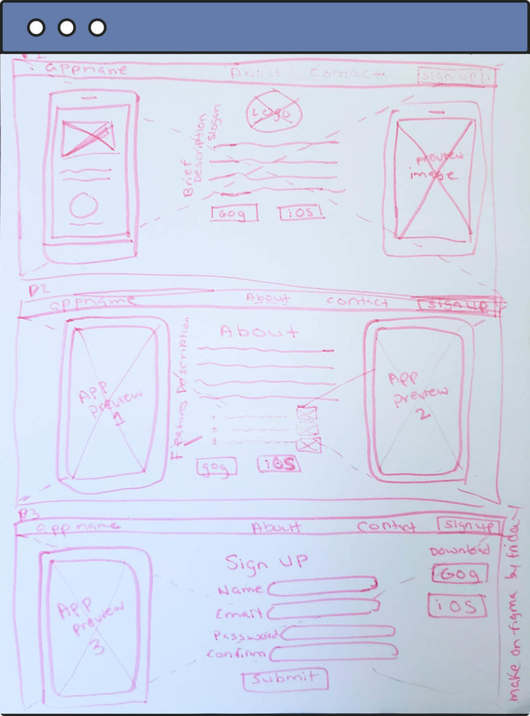
Step 3: Refine again and create a wireframe for the design on Figma.

My first wireframe, upon design review had issues.
- The design pattern I originally chose was not suitable for desktop use. The small dots to click through to get info about the app were not at all accessible or intuitive.
- The user would need to take too many steps clicking through each aspect of the content, likely resulting in disinterest or abandonment — 🚨Bad for business and the users!🚨
So I had to go back to the drawing board...
Step 4: Research more design patterns for landing pages on the web.
Step 5: Refine my paper sketches based on the patterns I thought were effective in conveying the content strategy given to us.
Step 6: Adapt my new paper sketches to a new wireframe design in Figma.

The second wireframe was much improved, and I received positive feedback from my instructors. Now it was time to refine the skeleton into a full fledged design and remain open to more constructive criticism.
The Fun Stuff: Color and Typography
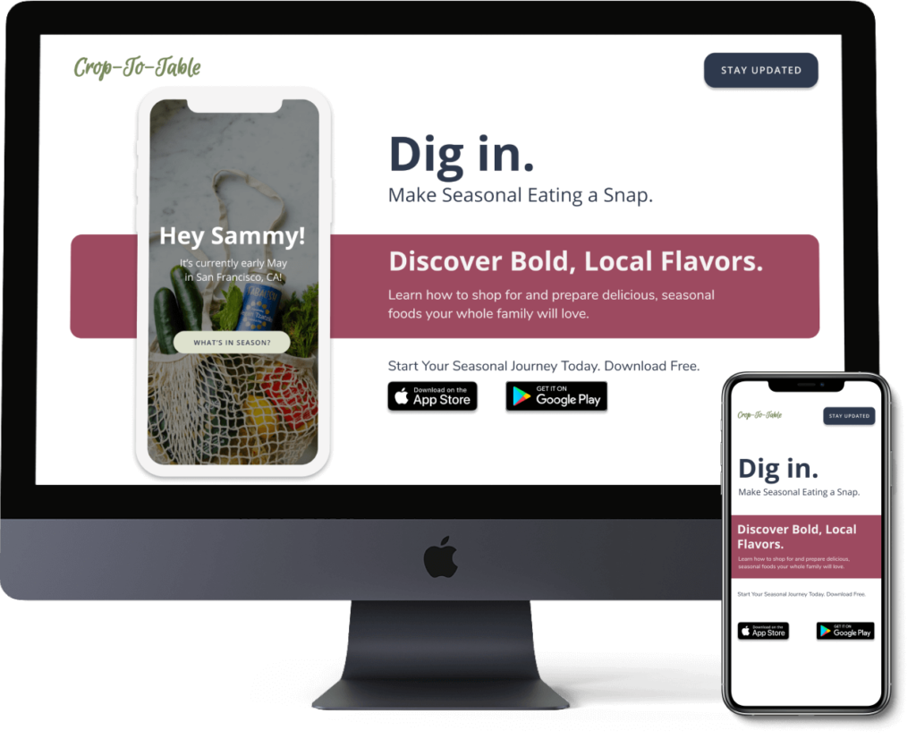
I adapted the new concepts I learned about content hierarchy, font pairings, typographic scale, and color theory into a clean and refined landing page to promote the product, Crop-To-Table.
Step 7: Create a mood board to gather relevant imagery, font, and color inspiration. I took a lot of my inspiration from fresh produce and greenery.
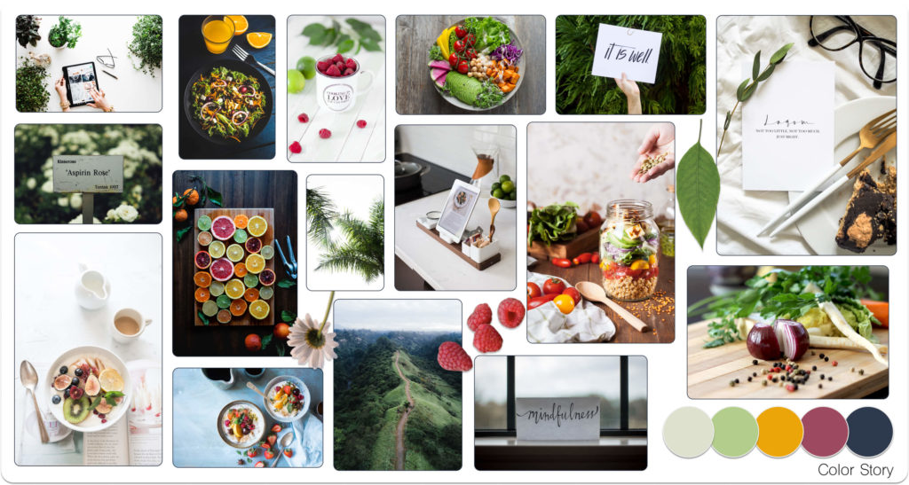
Step 8: Decide on a font pairing and a typographic scale. I chose fonts that was on a scale between playful and conservative, and stuck with clean and readable san serifs (Nunito and Open-Sans.)
Step 9: Choose imagery and finalize the color scheme. I adopted a complementary color scheme of reds, greens, and blues—earthy and relevant to the feel of the product.
Step 10: Refine the content strategy, coming up with additional taglines and engaging copy to draw the users in.

I added new copy to the hero, as well as an app preview (note that the app preview is a placeholder for the actual app UI — the intention was that once the mock app is complete, this would be replaced with an simple animation of the app in action or a simple welcome screen.
The Design Refined...and Refined Again
I presented my initial design to my instructors. Though my color choices and fonts were well received, however I got some feedback regarding my layout and functionality:
- That the formatting in the hero should remain consistent, not to mix centered text and left justified text.
- The alternating colored bar formatting on scroll was a bit distracting and might not be helping to draw the eye as expected.
- The sign up page is misleading. What are they signing up for? Logging into? This feature was unnecessary for a website meant to get users to download an app where they would ideally be signing up in app.
I made a second iteration of the design keeping that feedback in mind.

- I changed the main scroll content area to one single color, feeling that the serene green color would be a good choice to convey the product message of sustainability and health consciousness.
- I left justified all my text and made some color changes to some of the headings to make it more cohesive and simplistic.
- Lastly, instead of a sign up, I did an email opt-in for a proposed newsletter with the intention of keeping the prospective user updated on related content.
I presented my finalized design to my class and instructors. I was given a few more comments and feedback for proposed changes, but overall the design was approved to move into the next step…
Rapid Prototyping
We were tasked to add some basic functionality to what we created. We first created a clickable prototype in Figma where the site would be made navigable. There I decided on hover states, clickable elements, and page transitions. For the sake of the design, I kept mine fairly simplistic as I only had two pages for my site, an introduction and a newsletter sign up.
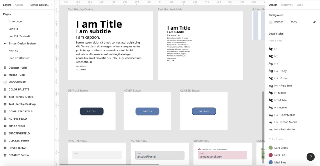
Style Guides: Their Importance for Developer Handoff
Before any design can be implemented, it’s important to finalize the details and create documentation for a developer to understand. We were then tasked to create a Style Guide for our design. This makes it easier for a dev to understand your intentions clearly.
However, this is not a one and done. We as Designers must be mindful and allow room for back and forth between us and the development team. It’s important that neither of us work in a silo and iterate together through the entire process.
Post handoff, communication windows should remain open.

Code in HTML and CSS - Responsive Web Design
Lastly, we were tasked to bring our designs to life in code ourselves. The goal is to give us as designers an understanding of what can and can’t be done when designs are translated to code. We were required to code one page of what we designed.
Though I had many trials and tribulations, I effectively learned and implemented:
- Semantic HTML
- Accessible HTML
- Media Queries in CSS for Responsive Web (I took the desktop first approach)
Though my code still has a few quirks and bugs I’m working out and correcting, I managed to translate my Figma design in to a coded web page. My personal goal is to continue to improve my coding skills.
You can view it for yourself on Glitch below! (Best viewed on desktop using this link.)
Lessons & Outcomes
- Overall I discovered my emerging strengths in Visual Design and Front-End code, although I want to continue to home my skills in all aspects of UX design.
- I also deeply enjoy Content Strategy and UX Writing. Though all the content was not mine, I did come up with some of the taglines outside of the main blurbs. Interested in learning more and growing my skills in this discipline.
- Visual Design is a process and the first design isn’t always the right solution. You must be open to feedback and be able to implement said feedback quickly and effectively.
- It’s more important than ever for designers and developers to communicate and understand a little bit of what the other does. As a designer, refining my technical skills in front-end web development is very important to me. I’m actually learning JavaScript next. Lifetime learning!
Though this is a mock product, it was a great experience learning all of these skills and piecing them together into a finalized coded page. I will continue to refine my visual design and UI skills while continuing on my UX career journey.